Creating “Digital-First” Product Visuals for Mobile Work Gear Using AI
 Cynthia
As hybrid work and digital nomadism continue to grow, mobile office gear—like foldable keyboards, portable monitors, work backpacks, and adjustable stands—has become a top seller on cross-border platforms and independent shops. For this category, visual strategy has shifted away from product specs toward storytelling through scenes, efficiency, and digital synergy. And image is the first language consumers read.
This blog unpacks how to use Pic Copilot and its AI image templates to create high-CTR visuals tailored for mobile office products. From scene simulation and cross-device synergy to UI layering and visual distribution, we’ll walk through how to bring out the digital-first logic behind every shot. The goal: help brands and designers create visuals that convey clarity, flexibility, and trust at first glance.
1. Why Mobile Work Product Images Must Be Digital-First
1.1 Meet the Digital-First Buyer
Mobile office buyers are digitally native: freelancers, remote workers, startup teams, content creators. Their decisions are driven by how well a product fits into their digital routine—not just how it looks or how light it is. Effective visuals need to hit three key “digital-first” notes:
- Highlight Seamless Cross-Device Use:

- Show laptops + tablets + phones working together.
- Examples: Laptop screen mirrored on portable display, phone as a preview screen, foldable keyboard + stand setup.
- Use Pic Copilot’s “Multi-Device Workflow” or “Scene Collage” templates.
- Emphasize Digital Experience Over Hardware Aesthetics:
- Show screen interfaces like task boards, cloud sync, video meetings.
- Position products in real use: couch corners, train seats, coffee tables.
- Add UI overlays of Notion, Slack, Figma, etc., to boost digital relevance.
- Create an Immersive Productivity Mood:

- Use blurred backgrounds + sharp product focus to convey zero-distraction environments.
- Templates: “Focused Workflow,” “Blurred Background + Highlight,” “AI Light Shadow Enhancer.”
2. Image Composition: Structure and Elements That Work
Digital-first images are about clear communication of use and value. Instead of isolated product shots, structure images as modular storytelling:
2.1 Main Zone: Active Product Use
- Use golden ratio or rule of thirds for balance.
- Combine tools: laptop + stand, keyboard + touchpad, backpack open with organizer view.
- Add hand gestures or user posture to show “in use.”
- Template: “User Interaction” template with auto-hand placement.
2.2 Secondary Zone: Info + Function Layers
- UI overlays: to-do lists, sync icons, video grid previews.
- Functional tags: battery life, weight, Bluetooth compatibility.
- Highlight features like “1cm thin,” “15h battery,” “folds into pouch.”
- Template: “Text + Icon Overlay,” “Spec Label Layout.”
2.3 Background Layer: Emotion + Brand Tone

- Choose spaces like hotel desk, train seat, airplane tray, or café corner.
- Lighting: natural daylight or warm tones to signal energy.
- Color palette: mist blue, stone gray, light wood—avoid busy visuals.
- Template: “AI Scene Builder+ Light Setting.”
3. Scene-Specific Templates: Matching Products to Usage Contexts
3.1 Business Travel

- Products: work backpack, foldable keyboard, portable monitor, mini mouse.
- Scenes: train seat, small café table, airport lounge.
- Focus: “light carry, instant setup.”
- Templates: “Travel Minimal,” “Open Bag Layout,” “Compact Gear Setup.”
3.2 Team Collaboration

- Products: Bluetooth keyboard, adjustable stand, digital notebook, mic.
- Scenes: shared desk, conference call background, multi-screen setups.
- Focus: show remote sync, device linking, screen sharing.
- Templates: “Multi-Screen Collab,” “UI Overlay Composite,” “AI Video Host.”
4. How to Build a Sense of Efficiency Using Layers
4.1 Simulate Multi-Tasking Screens
- Stack 3 active windows (e.g., Zoom + Docs + File Sync).
- Use real UI elements from apps like Notion, Slack, Zoom.
- Upload PNG/PSD layers into Pic Copilot’s interface composition engine.
4.2 Create Static Motion Cues
- Add arrows, dashed lines, timeline prompts.
- Simulate file drag/drop or device sync animations.
- Use dynamic templates or multi-frame slicing tools to show flow.
4.3 Visual Time Efficiency Cues
- Labels like “Drafted in 15 min” or “Wrapped in 30 min.”
- Add clocks, progress bars, countdown icons.
- Templates: “Efficiency Tag,” “Icon Stack,” “Timeline Visual Cue.”
5. Visualizing Portability and Setup Flexibility
Mobile office products must look easy to carry and quick to deploy. AI visuals can express that clearly:
5.1 Show Work-Anywhere Potential

- Scenes: shared space, corner table, sofa arm, train seat.
- Composition: open device, natural posture, coffee + earbuds nearby.
- Lighting: soft daylight, relaxed tone.
5.2 Product Combos for Flexible Setup

- Combine keyboard + stand + phone/tablet/laptop in one frame.
- Add usage actions: connecting, unfolding, sipping coffee while working.
5.3 Demonstrate Product States
- Folded vs. expanded view (static comparison or animation).
- Size reference: fit in bag, airplane pocket, compared to a notebook.
- Templates: “Open-Close Contrast,” “Bag Fit,” “Size Comparison Layout.”
5.4 Visualize Lightweight Workflows
- Add mini-timeline: “9:30 list in subway → 11:00 café call → 2:00 hotel wrap-up.”
- Layer expression icons, timestamps, place tags for continuity.
6. Generating Platform-Optimized Visuals with AI
Cross-platform fit is key. AI ensures fast resizing, layout control, and brand consistency:
6.1 One Visual, Many Uses
- Start with wide hero image → auto-generate square (IG), vertical (Xiaohongshu), 16:9 (TikTok).
- Keep structure; adjust crop, blur edges, reposition text.
- Template: “One Click Multi-Size Adaptation.”
6.2 Local UI + Social Style
- Xiaohongshu: prefers tags, arrows, daily tone.
- Instagram: loves filters, emoji, layered text.
- Amazon: clean product shots, white background.
- Facebook Ads: scene + person + price badge.
6.3 Language & Keyword Auto-Switch
- Translate core tags: e.g., “15h battery,” “digital sync.”
- Available in EN, FR, PT, KR, ES, RU.
- Bottom-right area adds hot words per region.
- Template: “Multilingual Text Layer.”
7. Expressing Brand Tone and Future Office Concepts
Images now shape identity and vision—not just sales:
7.1 Visual Consistency
- Brand color themes: cool tones like mist gray + cobalt blue.
- Use same font, spacing, logo position.
- Templates: “Brand Identity Kit,” “Preset Visual Style.”
7.2 Concept Visuals for Future Office
- AI work UI (co-editing interfaces)
- Cloud desktops syncing across devices
- Floating layers, soft glow, virtual terminals
- Templates: “Virtual Office,” “UI Overlay Expression,” “Tech Filter Scene.”
8. Final Thoughts: From Design to Deployment
Designing mobile office visuals with a digital-first mindset means more than chasing clicks—it means telling the story of your product in a new way.
With Pic Copilot, small teams and solo sellers can now create polished, high-performance visuals without a studio budget. Whether you’re on Shopify, Amazon, TikTok, or building your own brand site—these templates give you speed, structure, and storytelling.
Suggested Workflow: 1. Define use scenario (meeting, travel, remote setup) 2. Choose visual mood (focused, agile, premium) 3. Open Pic Copilot → pick template (collage, hero, info overlay) 4. Upload product/scene images + key phrases 5. Export, crop, publish
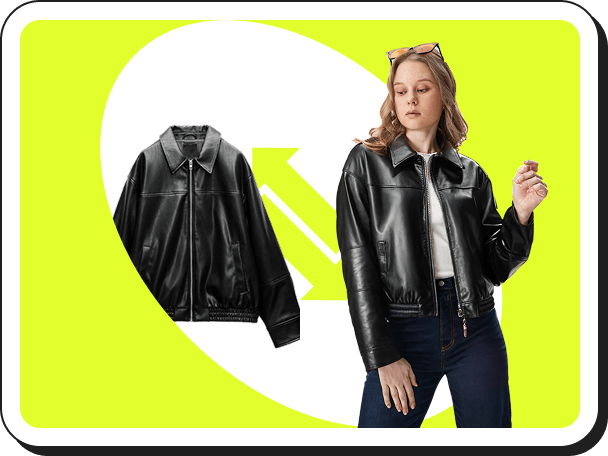 Virtual Try On
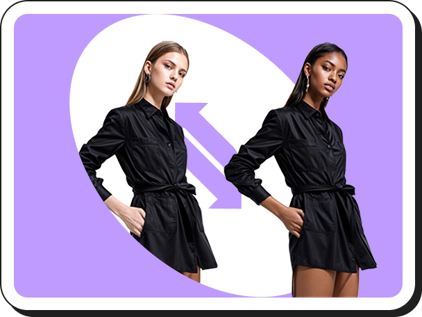 AI Model Swap
 Fashion Reels
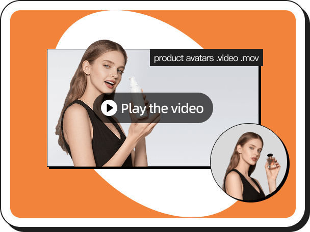 Product Avatars
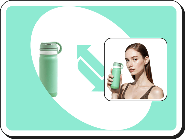 Product AnyShoot
 Virtual Try On Accessories
 AI Backgrounds
 Style Clone
 Remove Watermark
 AI Templates
 Image Translator
 Virtual Try On Shoes
 AI Avatars
 Background Remover
 AI Shadows
 Image Upscaler
 Image Enhancer