


 Probador Virtual
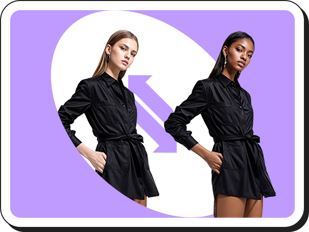 Cambio de modelo de IA
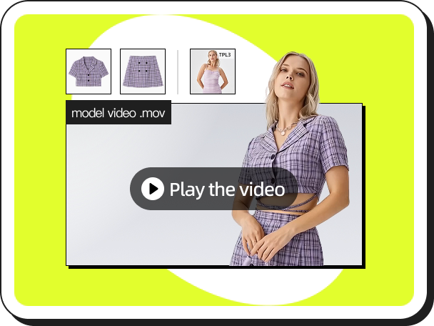 Videos de Moda
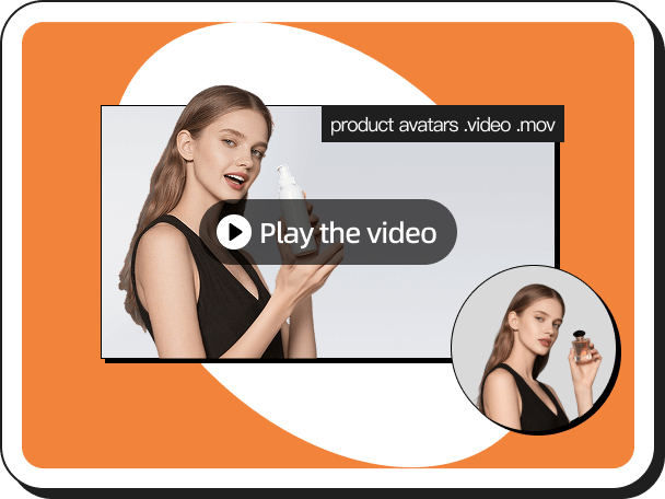 Videos de Productos en Mano
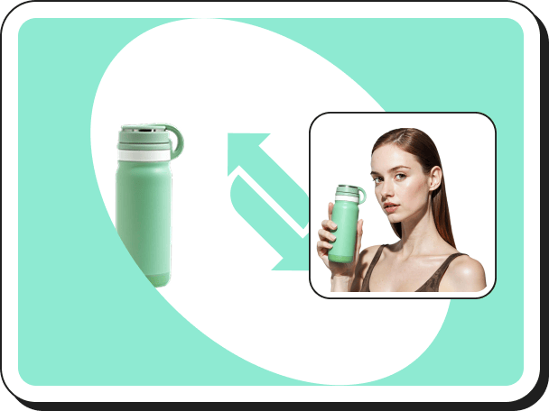 Vista en mano
 Prueba Virtual de Accesorios
 Fondos de IA
 Clon de estilo
 Eliminar marca de agua
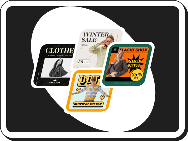 Plantillas de IA
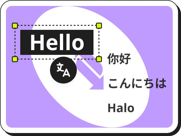 Traductor de Imágenes
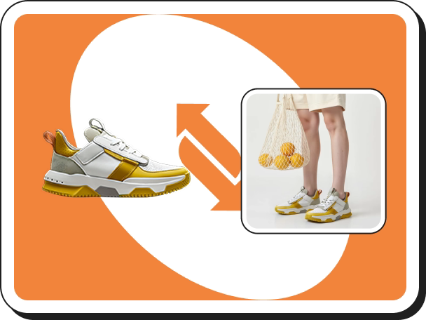 Probador Virtual de Zapatos
 Avatar de IA
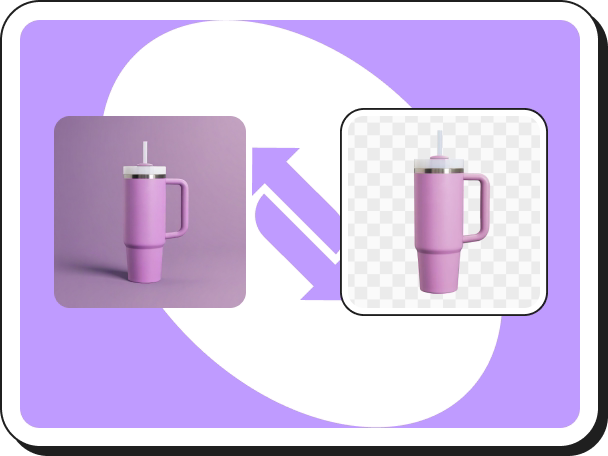 Removedor del fondo
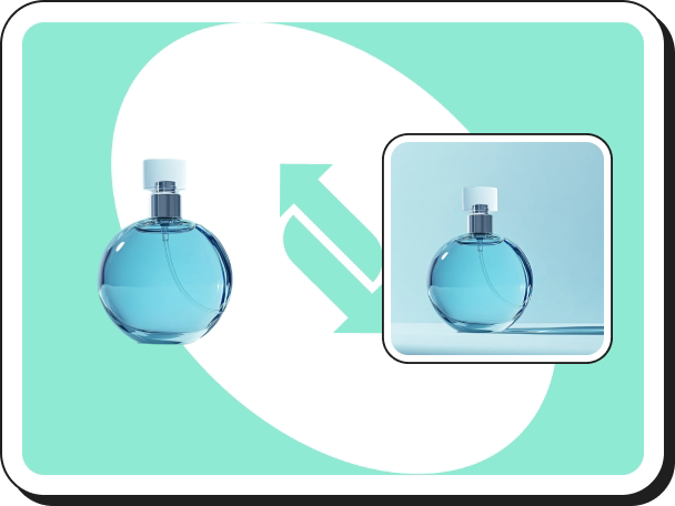 Sombras de IA
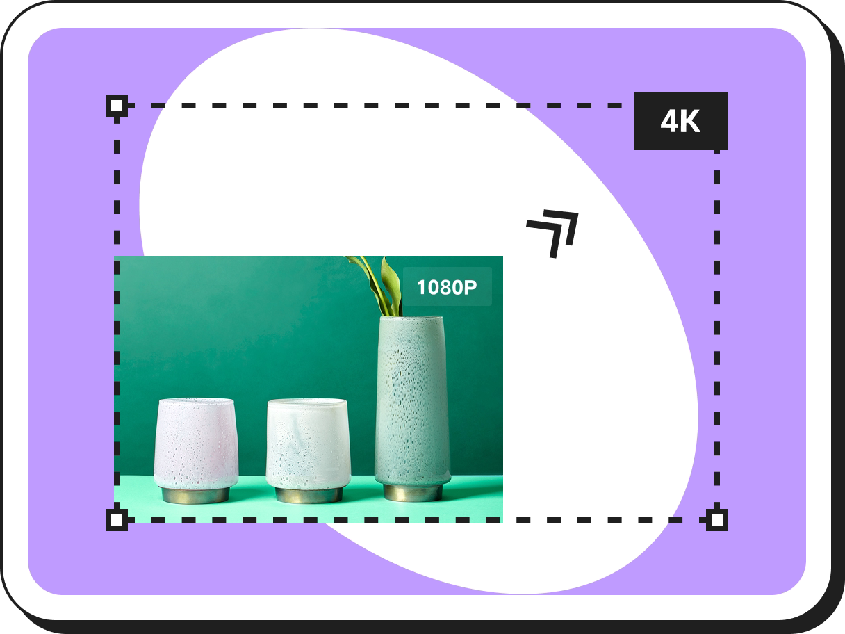 Escalador de Imágenes
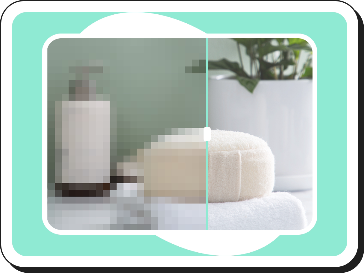 Mejorador de Imágenes
6 Best Amazon A+ Content Examples to Boost Conversion (2026 Gallery)
 Pic Copilot Team
Introduction: Your Listing Has a Lifespan of Only 3 Seconds
Picture this: A customer looking to buy "Vitamin C" is lying on their couch, rapidly scrolling through the Amazon app with their thumb.
In 2026, attention is the scarcest resource. Data shows that the average customer dwells on a listing for just 3 seconds. Within this make-or-break window, dry Bullet Points are powerless—only images can speak.
Psychological studies indicate that the human brain processes images 60,000 times faster than text. This means your Amazon A+ Content isn't just a product manual; it is your brand's "visual hook."
Many sellers searching for "Amazon listing images" or "Amazon enhanced brand content examples" are often just looking for pretty pictures to mimic. But true Top Sellers know that behind every high-converting A+ page lies precise sales logic and psychological triggers.
But what is the budget required to build such a page?
If you are struggling to decide between spending thousands on an Agency or doing it yourself, we suggest you read our deep-dive financial analysis first: [Amazon A+ Content Cost: Is It Free? Agency vs. AI Pricing]. That article will help you crunch the numbers, while this one focuses on solving the question: "What kind of images should I make?"
Next, we will take you into the 2026 High-Conversion Design Gallery. We have selected 6 textbook-level examples, ranging from Home & Kitchen to Supplements, to reveal the visual secrets that make conversion rates skyrocket.
What are the 4 types of A+ content?
Before diving into the examples, you need to understand the "canvas" Amazon provides. Many sellers looking for A+ content ideas don't even realize they have multiple options.
1. Standard A+ Content
This is the most common type.
- Keywords: Standard A+ content modules, Amazon image requirements
- Usage: Telling the brand story and building trust through a combination of text and images. It is the standard for all Brand Registry sellers.
2. Premium A+ Content
Once a privilege for top-tier sellers, this is now open to those who meet specific criteria.
- Keywords: Amazon premium A+ content, video modules
- Features: Full-width design (1464px), supports video and interactive hotspots. It offers extreme visual impact and a superior mobile experience.
3. Amazon Brand Story
An often-overlooked section located above the main A+ content.
- Keywords: Amazon brand story examples, Amazon storefront examples
- Usage: Used for cross-selling other products in the store and establishing an emotional connection with the brand.
What makes a "Best-Seller" A+ Page?
Before looking at the cases, we need to establish a consensus: Good looking does not equal good selling.
A truly excellent A+ page must possess the following 4 "genes":
- Visual Hierarchy: Guides the customer's eye from "What is this?" to "Why buy it?"
- Skimmability: Even without reading the text, the infographic icons and headlines communicate the selling points.
- Trust Signals: Eliminates concerns through natural organic background images or certificates.
- Mobile Optimization: 70% of transactions happen on mobile. If your text is too small, you lose the sale.
2026 Best Amazon A+ Content Examples Breakdown (Core Case Deep Dive)
We aren't just showing images; we will dissect these 6 cases from four dimensions: Visual Style, Design Psychology, Traditional Production Costs, and SEO Strategy.
Case 1: Naturyn Psyllium Husk (Supplement)
—— The Pinnacle of Ritual and Trust
1. Visual Style: Dark Mood Photography
This is an extremely bold and premium design. Unlike the common "white background big image," Naturyn adopts a Dark mode product design. The full-width black and gold background feels like a high-end laboratory table. In the frame, fine powder cascades from a wooden spoon, surrounded by scattered fresh green leaves and raw grains.
2. Design Logic: Why does this design sell?
- Perceived Value: In color psychology, dark backgrounds represent "luxury," "professionalism," and "purity." For a dietary supplement, this implies high concentration and no additives.
- Ingredient Spotlight: Using lighting techniques (Chiaroscuro), the light focuses only on the product and raw materials, darkening the surroundings. This forces the consumer's gaze to lock onto the "natural ingredients," establishing a strong natural product background association.
- Trust Module: The bottom of the page doesn't end abruptly; instead, it features a Testimonials module, juxtaposing real user avatars with 5-star screenshots and a "10/10" rating. This directly penetrates the consumer's psychological defense regarding whether supplements "actually work."
3. Traditional Production Cost
To replicate this image, you need:
- Studio: Rental fee $500/day.
- Gaffer: Precise light ratio control, labor cost $300.
- Props: Solid wood table, fresh plants, vintage wooden spoon, purchase cost $100.
- Post-production: Retouching powder impurities, $50/image.
- Total: ~$1,000+ just for this one Hero Image set.
4. The AI Solution
- Prompt Idea: "A jar of psyllium husk powder on a dark rustic wooden table, surrounded by fresh green leaves and raw grains, cinematic lighting, dark mood photography, 8k resolution, photorealistic."
- Using AI, you can generate this organic product photography style in 30 seconds for almost zero cost.

Case 2: Fegsy Yoga Bricks (Fitness)
—— The Model of Scenario-Based Experience
1. Visual Style: Macaron Colors & Lifestyle
The entire page exudes a light, joyful atmosphere. It uses low-saturation pink and light blue as backgrounds, perfectly fitting the aesthetic preferences of the yoga demographic.
2. Design Logic: The Role of Mirror Neurons
- Mirror Neurons: Why must you include real people? When a consumer sees a model doing a difficult stretch, the mirror neurons in their brain activate, and they subconsciously imagine, "I can do this move too."
- In-Context Shots: The page doesn't just show the brick; it shows balance, support, and assisted stretching through multiple lifestyle product shots. It’s not selling a piece of foam; it’s selling a "disciplined and beautiful lifestyle."
- Feature Callouts: Addressing pain points like "too hard" or "slippery," the design uses close-up shots to showcase the 45D high-density texture and 3D cut angles.
3. SEO Strategy
- Alt Text: "Woman using yoga brick for stretching exercises in a bright living room, showcasing fitness photography and home workout setup."
- This description accurately captures potential customers searching for yoga block exercises image traffic.
4. The AI Solution
Shooting real yoga scenes is extremely expensive (model fees + location fees). Current AI photo generator for Amazon tools allow you to upload a product image and select a "Yoga Studio" or "Cozy Living Room" template. The AI automatically synthesizes a model using your product with natural posture.

Case 3: Air Technik Air Filter (Auto Parts)
—— The Precision of Hardcore Industrial Style
1. Visual Style: 3D Exploded View & Tech Blue
This is a typical industrial product photography style. The background uses a cold-tone "Tech Blue" gradient, conveying signals of cleanliness and efficiency.
2. Design Logic: Visualizing the Invisible
- Exploded View: The activated carbon layer inside an AC filter is invisible to the consumer. This case peels the filter back like a cake (Particulate Filter -> Activated Carbon -> Reinforcement Layer). This Amazon infographic design makes the "multi-layer filtration" selling point visible to the naked eye.
- Compatibility Chart: The biggest nightmare in the auto parts category is returns (due to buying the wrong model). Air Technik places a huge Vehicle Compatibility Check table prominently on the page. This is not just content; it is a "return prevention guide," drastically reducing after-sales costs.
3. Traditional Production Cost
- 3D Modeling: Creating a high-precision product exploded view usually costs $800 - $1,500.
- Rendering: Extra charge per 4K render.
4. The AI Solution
Utilizing AI's tech specs visualization function, you only need to upload the product exterior and describe the internal structure (e.g., "3 layers"). The AI can generate a structural diagram with perspective effects—while not a CAD-level engineering drawing, it is more than sufficient for marketing.

Case 4: Rhodiola Rosea (Health)
—— Modern Medical Aesthetics & Rational Decision Making
1. Visual Style: Minimalist & Clinical
Ample White Space accented with fresh green fonts. This clean beauty aesthetic style is common in high-end cosmeceuticals and prescription drugs, giving a psychological suggestion of being "sterile," "safe," and "doctor-recommended."
2. Design Logic: Eliminating Decision Fatigue
- The Comparison Chart: This is the conversion king of A+ pages. When consumers search for Rhodiola, they face dozens of choices, resulting in "decision fatigue."
- "Us vs. Them": This page bluntly lists "OURS" and "OTHERS." Ours: 3rd Party Tested ✅, 120 Count ✅, High Purity ✅; Others: No Testing ❌, 60 Count ❌, Fillers ❌. This product comparison table instantly makes the decision for the customer.
- Macro Shots: Using a macro lens to capture the moment a capsule is opened and powder pours out, emphasizing the "Therapeutic Grade" fill fullness.

Case 5: Aquélle Face Cream (Beauty)
—— The Art of Breathability and Flow
1. Visual Style: Water Ripple Aesthetics
The main color tone of the page is clear mint green. The background extensively uses water ripples, droplets, and translucent materials. This is a typical application of liquid splash photography.
2. Design Logic: Synesthesia
- Texture Visualization: The biggest pain point of buying skincare online is that you "can't touch it." Aquélle shoots close-ups of the cream being scooped up by a spatula and spread on the skin (texture shots photography).
- Appetite Appeal: This creamy texture gives customers a desire that their "skin wants to eat it."
- How-to Guide: Even for a simple cream, it includes a simple 1-2-3 massage step diagram. This is not just a tutorial; it is selling a "sense of ritual," implying that using it gives you a Spa-level experience.
3. The AI Solution
Shooting liquid splashes is one of the most difficult techniques in photography, requiring high-speed cameras and countless failed attempts.
- Prompt Idea: "A jar of face cream submerged in shallow crystal clear water, water ripples, sunlight caustic effects, fresh mint green tone, 8k, hyper-realistic."

Case 6: Metafactor Omega-3 (Family Health)
—— High-End Warm Tones & Family Connection
1. Visual Style: Warm Gradient & Depth of Field
Unlike the coolness of Rhodiola, Omega-3 chooses warm orange (the color of fish oil). It uses a wide aperture to blur the background, making the product the absolute focus.
2. Design Logic: Simplifying Complex Selling Points
- Iconography: Fish oil functions are complex (heart, brain, joints, vision). Metafactor avoids long sentences and instead designs 4 flat infographic icons. On Amazon A+ mobile, icons are far more efficient to read than text.
- Emotional Connection: The final module of the page is a photo of a whole family (grandparents, parents, children) laughing in the sunlight. This utilizes family lifestyle images to convey a strong message: "This isn't just medicine you take; it's love for your family." This emotional marketing effectively increases the average order value.

The Anatomy of High-Conversion A+ (Universal Framework)
After seeing these 6 best Amazon A+ content examples, have you noticed some commonalities? No matter what you sell, a money-making page cannot exist without this "skeleton":
- The "Hero" Module: Must occupy more than 40% of the screen; image quality must be Amazon premium A+ content level.
- The "Problem/Solution": Like Air Technik, show the problem (dirty air) first, then the solution (multi-layer filtration).
- The "Proof": Whether it's a Comparison Chart or Testimonials, you must provide evidence.
- The "Close": End with an emotional image (like a family photo) or brand story to increase brand stickiness.
Why Can't Your A+ Page Achieve This Effect? (The Cost Barrier)
Your head might be full of inspiration now. You want Naturyn's texture, Fegsy's scenes, and Air Technik's 3D effects.
But when you try DIY Amazon A+ content, reality hits hard:
- Flat Composition: Your white background photos look lifeless; you don't know how to use shadows and props (product photography props).
- Broken Logic: There is no narrative flow between images; it's just a pile of pictures.
- Prohibitive Costs: As detailed in our article [Amazon A+ Content Cost: Is It Free? Agency vs. AI Pricing], to assemble a photographer, gaffer, retoucher, and modeler to replicate any of the above cases, the startup capital for a single product is at least $1,500 - $3,000.
This is exactly where PicCopilot ai product detail page design generator changes the game. It shortens a design process that used to take weeks down to 1 minute through a powerful AI engine.
Create Top-Tier A+ Pages with AI in Just 3 Steps
Step 1: Upload & Configure
You don't need perfect model photos. Just upload a plain product image and select your target language and template.
- AI Smart Recognition: PicCopilot automatically identifies your product category (e.g., Electronics, Beauty, Auto Parts) and matches the design tone and layout logic best suited for that category.
- One-Click Background Removal: The system automatically clears cluttered backgrounds, keeping only the clean product subject, ready for synthesis.

Step 2: AI Deep Analysis & Brand Customization
AI doesn't just draw; it understands marketing.
- Selling Point Generation: The AI deeply analyzes your product's selling points and automatically generates persuasive copy and visual selling point images.
- Brand Integration: Simply upload your brand Logo, and the AI seamlessly integrates it into the entire A+ page, ensuring the visual style is highly unified with your brand tone.
- Tech Calibration: You can chat with the AI assistant to supplement precise product parameters (e.g., material, specs) to ensure every technical detail is accurate.

Step 3: Generate, Chat-to-Edit & Download
This is the most magical step. PicCopilot, powered by the Nano Banana engine, generates a complete A+ detail page in real-time.
- Conversational Editing: Not satisfied? You don't need to push pixels with a mouse. Just tell the AI via chat: "Make the lighting softer" or "Change to a marble background."
- Instant Output: Once confirmed, you can download high-resolution visual assets with one click and upload them directly to Amazon Seller Central.

Conclusion: Don't Let Visuals Be Your Conversion Bottleneck
Through the 6 textbook examples above, it is not hard to see: The deciding factor on Amazon in 2026 is no longer simply "low price," but the professionalism of brand visuals. An image that can stop a customer's thumb is the strongest persuasion itself.
However, high-end photography, complex 3D modeling, and expensive design outsourcing should not be barriers for SMB sellers to advance. This is the meaning of PicCopilot's existence.
Our self-developed PicCopilot product detail page design generator has transformed the "visual logic" of those big-brand A+ pages into a 3-step automated workflow:
- From Raw to Cinematic: AI automatically handles cutout, background fusion, and lighting correction.
- From Specs to Selling Points: AI analyzes the product to generate high-converting copy and functional images.
- From Fixed to Custom: Adjust backgrounds, models, and styles anytime via conversational editing until it's perfect.
While your competitors are still fighting for a graphic designer's schedule, you can already be mass-producing flagship-store-level A+ content with AI.
Ready to boost your conversion rate?
[Click here to start your PicCopilot Free Trial] (Experience the magic of AI design instantly!)