


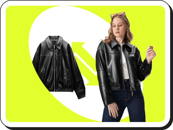
 バーチャル試着
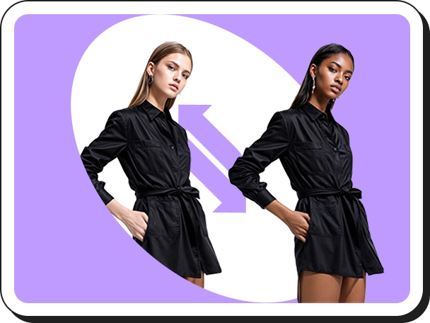 AIモデルの切り替え
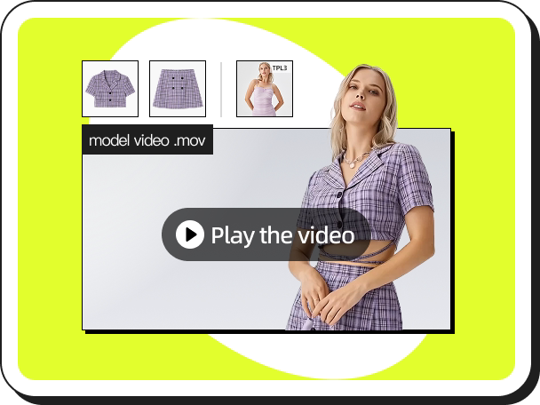 ファッションリール
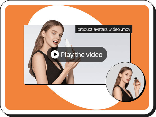 手持ち商品動画
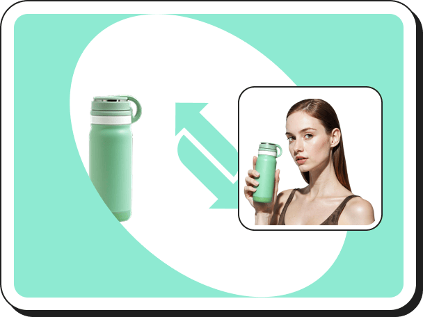 手に持った商品ビュー
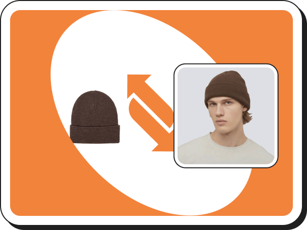 バーチャルアクセサリー試着
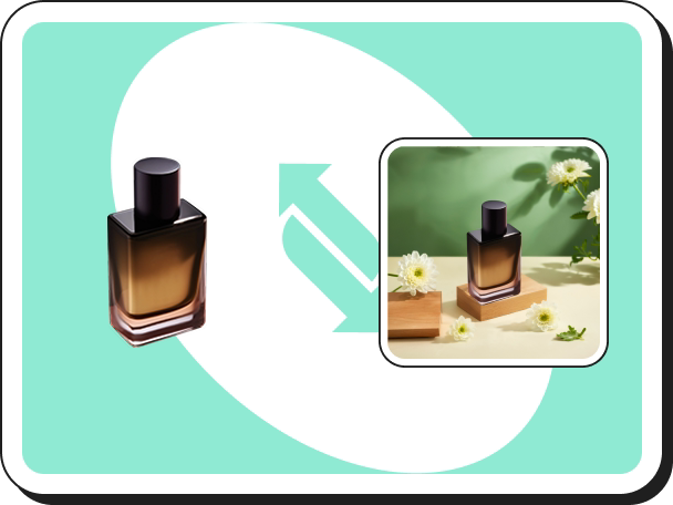 AI 背景生成
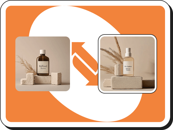 スタイルクローン
 ウォーターマーク削除
 AIテンプレート
 画像翻訳
画像翻訳 AIシューズ試着
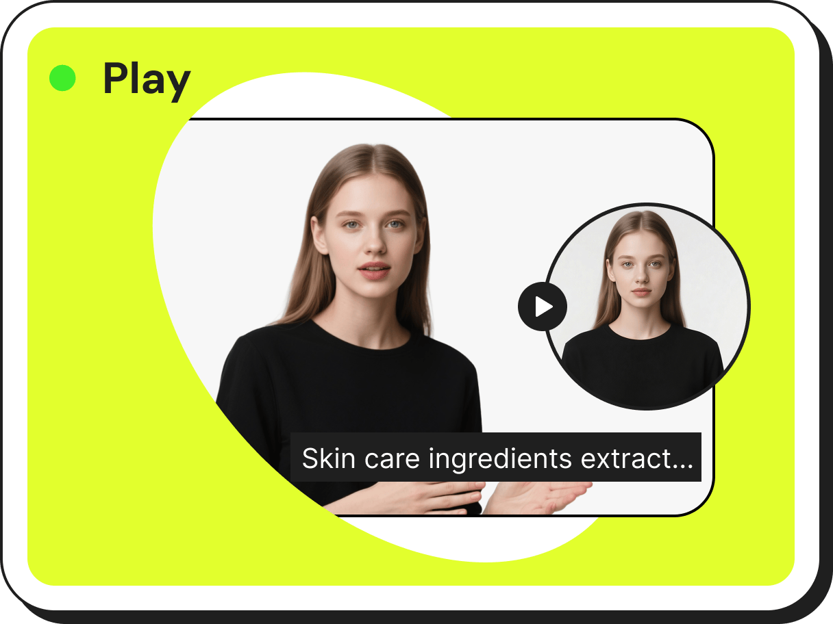 AI デジタルヒューマン
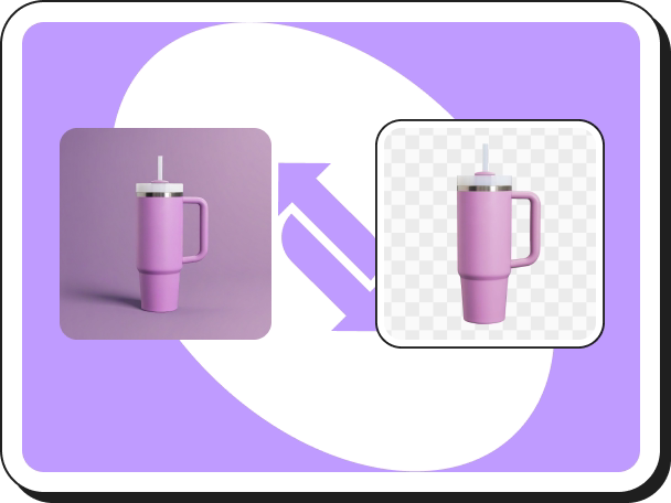 背景を削除
背景を削除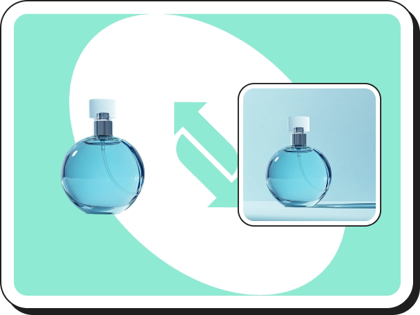 影作成ツール
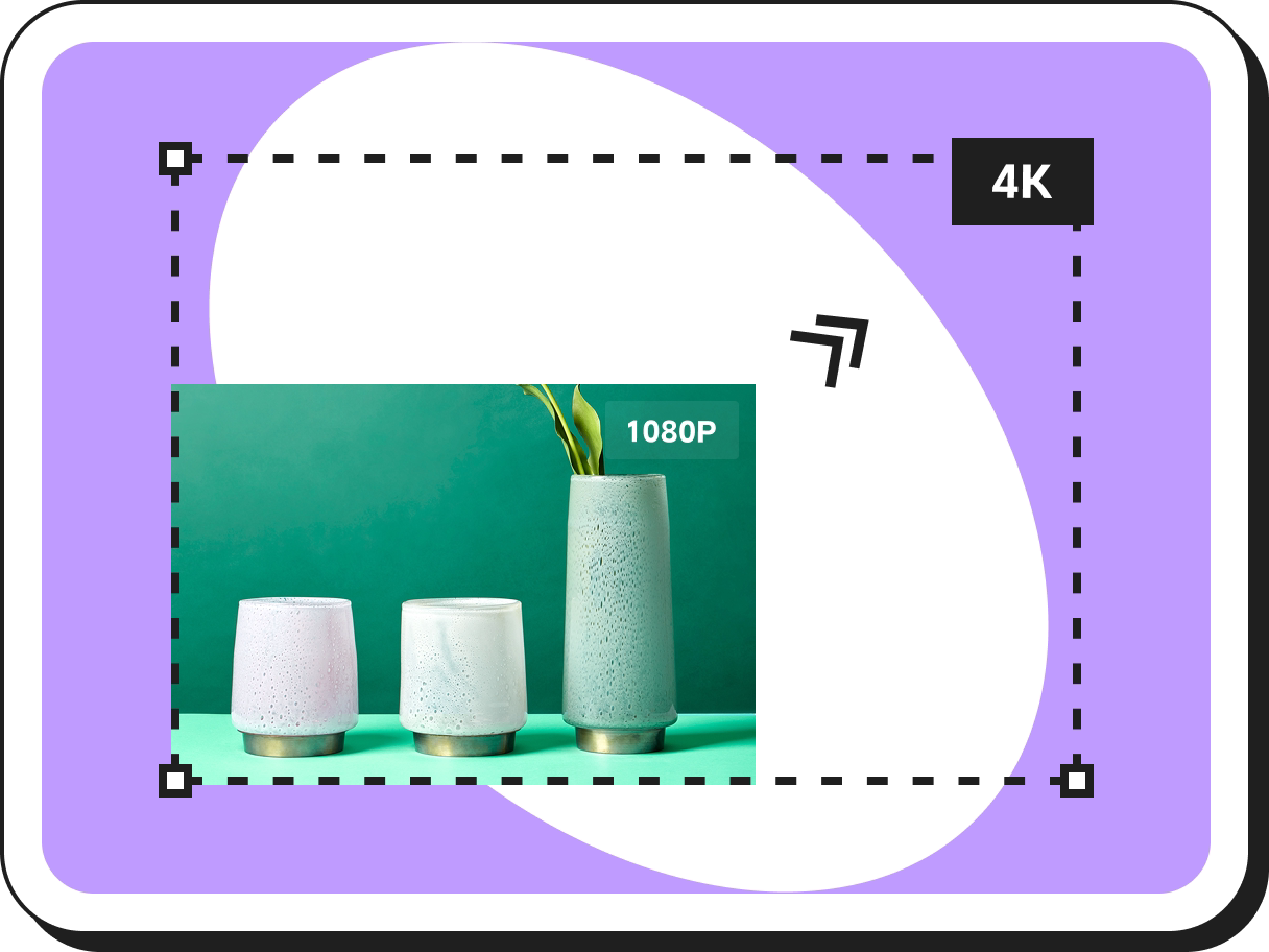 画像高解像度化
 AI画像高画質化
Single Product Page vs. Collection Page: The "Traffic Temperature" Framework for High ROAS
 Pic Copilot Team
In our previous guide on AI Product Detail Page Design Strategy, we solved the problem of production speed—how to get products online fast.
But speed alone doesn't guarantee profit.
Imagine you have successfully launched 50 new products this week using AI. You are running TikTok ads. The traffic is flowing. But your conversion rate is flatlining.
The problem usually isn't the product, and it’s not the speed. It’s the destination.
One of the most expensive mistakes in e-commerce is Destination Mismatch: Sending high-intent, cold traffic to a low-intent, generic Collection Page.
Today, we are going to fix your traffic routing strategy. We will deconstruct the battle between the Collection Page and the Single Product Page, and show you how to execute the winning strategy using the AI tools we’ve been discussing.
Part 1: The Landscape
What are the three types of landing pages?
To make the right strategic choice, we must first define the playing field. When e-commerce veterans ask "What are the three types of landing pages?", they are referring to three distinct stages of the funnel:
1. The Collection Page (The "Supermarket Aisle")
- Structure: A grid of thumbnails (e.g., "All Summer Shoes").
- Psychology: "I am browsing."
- Goal: Discovery & AOV (Average Order Value).
2. The Advertorial / Bridge Page (The "Storyteller")
- Structure: An article or blog post that educates before selling.
- Psychology: "I have a problem, tell me the solution."
- Goal: Warm-up & Education.
3. The Single Product Page (The "Sniper Shot")
- Structure: A dedicated product landing page design focused on one SKU. No sidebars, no distractions.
- Psychology: "I want that specific thing I saw in the video."
- Goal: Immediate Conversion.
Part 2: The Core Debate
Which type of website is most popular? (The "Amazon Trap")
If you ask "Which type of website is most popular?", the answer is obviously the Collection/Marketplace model (like Amazon).
But copying Amazon is dangerous for a growing brand. Amazon relies on customers searching for them. You rely on interrupting customers on social media.
The Data:
In our internal tests, sending cold TikTok/Facebook traffic to a Single Product Page outperforms sending it to a Collection Page by 300%.
Why? Because of Cognitive Load.
- Collection Page: "Here are 20 options. You choose." (High Friction)
- Single Product Page: "Here is the exact item you clicked on. Buy it." (Zero Friction)
Part 3: The "Traffic Temperature" Decision Matrix
So, when should you use which? It’s simple:
Scenario A: Cold Traffic (Ads & Virality)
- Source: TikTok, IG Reels, FB Ads.
- Strategy: Single Product Page Design.
- Why: You must maintain "Message-Match." If your video sells a vibe, the page must continue that vibe. A generic catalog kills the mood.
- Requirement: A focused single product ecommerce website layout.
Scenario B: Warm Traffic (Search & Retention)
- Source: Google Shopping, SEO, Email flows.
- Strategy: Collection Page.
- Why: These users want to compare prices and options. Don't restrict them.
Part 4: The Execution Gap (Connecting Strategy to Production)
Here is where the strategy usually breaks down.
If Single Product Pages are so much better for ads, why do 90% of Shopify stores still use generic templates?
Because building them is too slow.
As we established in AI product detail page design strategy, testing 20 products a week is necessary for growth. But coding 20 unique landing pages manually? That is impossible for most teams.
Most merchants compromise. They use a default template that converts poorly because they don't have the time to build a custom one.
Part 5: The Solution - AI-Driven Single Product Architecture
This is where AI shifts from "Content Creation" to "Strategy Enablement."
We can now use PiccoPilot's product detail page design tool to solve this bottleneck. It allows you to build specific landing pages for every single product you test.
How AI Solves the Design Rules Automatically:
In our previous article, 7 Golden Rules of Ecommerce UI Design, we discussed the importance of the "F-Pattern" and "Visual Context."
Manually applying those 7 rules to every page is tedious. AI does it instantly:
- Visual Context (Rule #6):
Instead of a white background, the AI acts as your ecommerce landing page builder, automatically placing the product in a relevant lifestyle scene (e.g., a tent on a mountain). This matches the "ad vibe" instantly. - Hierarchy (Rule #1):
The tool generates a product page layout that naturally guides the eye to the CTA, ensuring the "Thumb Zone" is respected on mobile. - Speed:
You get a high-converting, custom-looking single product page in minutes, not days.
Conclusion
Strategy without execution is just a dream.
- Understand your traffic: If you pay for the click, you owe them a dedicated page.
- Don't compromise: Never send ad traffic to a collection page just because you were "too busy" to design a landing page.
- Use Leverage: Use AI tools to build these pages at the speed of your ad spend.