


 Coba Baju Secara Virtual
 Ganti model AI
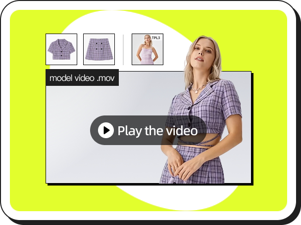 Video Fashion
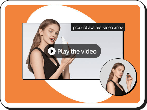 Video Produk di Tangan
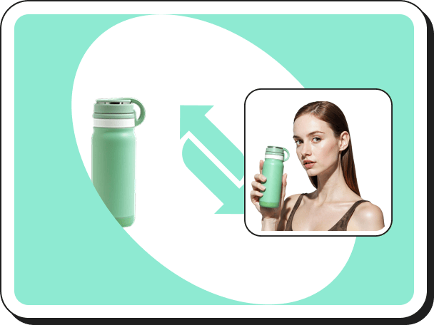 Produk di tangan
 Coba Aksesori Secara Virtual
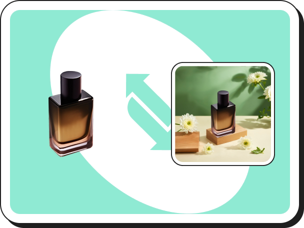 Latar Belakang Buatan AI
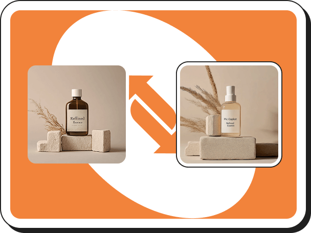 Salin Gaya
 Hapus Tanda Air
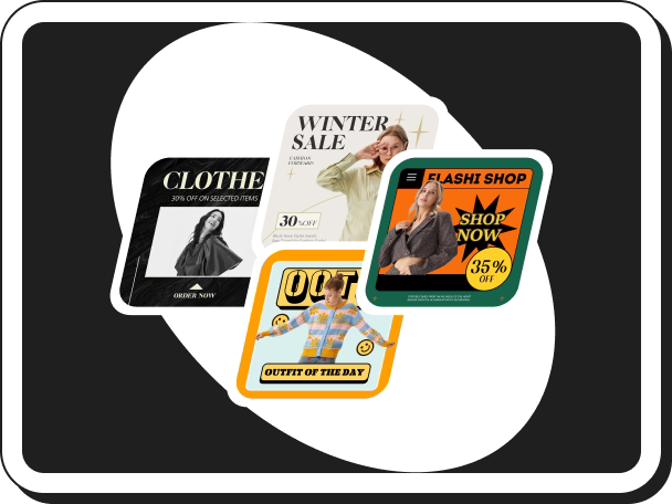 Templat Cerdas
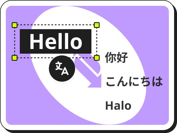 Penerjemah Gambar Otomatis
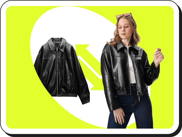
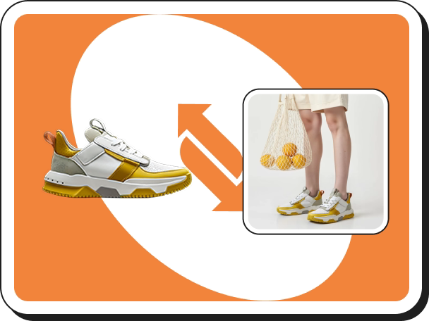 Coba Sepatu Secara Virtual
 Tokoh Virtual Buatan AI
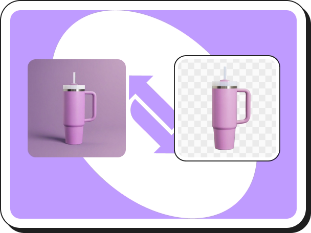 Penghapus Latar Belakang
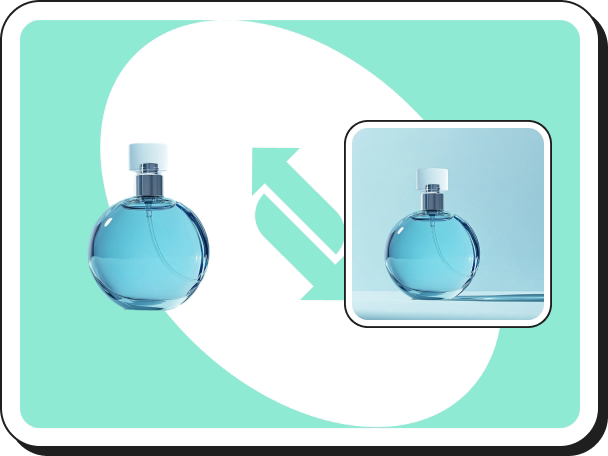 Bayangan Buatan AI
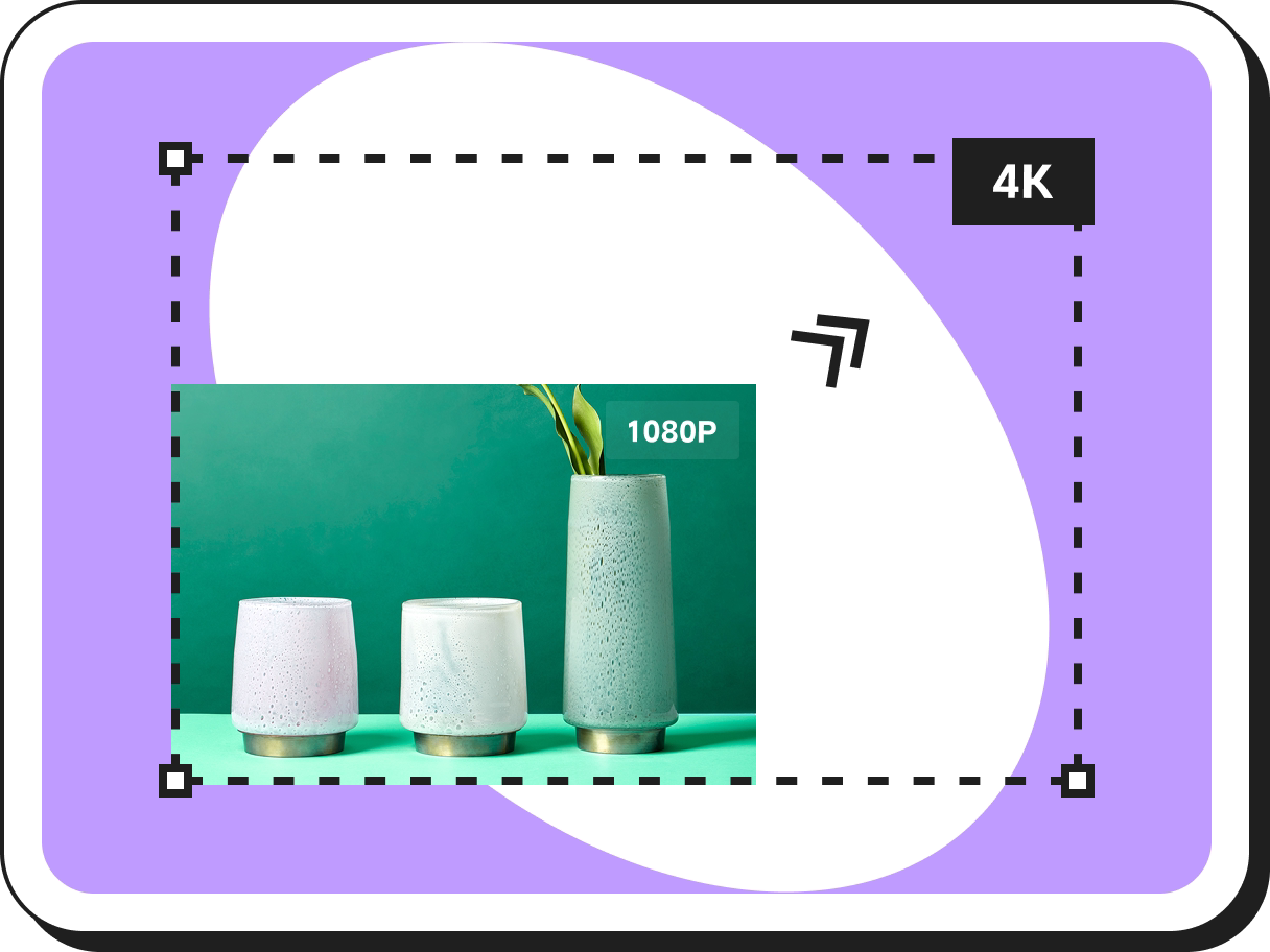 Perbesar Resolusi Gambar
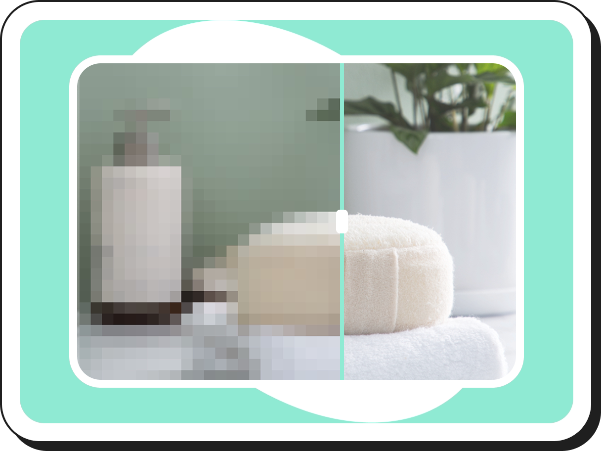 Peningkat Gambar
7 Golden Rules of Ecommerce UI Design That Double Add-to-Cart Rates
 Pic Copilot Team
You have optimized your Facebook ads. Your CPM is low. The traffic is flowing. Yet, your conversion rate is stuck at 0.8%.
The problem is rarely the product; it is usually the presentation. In the split-second attention economy, your product detail page design acts as the digital salesperson. If that salesperson is messy, confusing, or slow, the customer leaves.
We have analyzed thousands of high converting product pages across varying categories. The difference between a page that bounces and a page that converts isn't "artistic flair"—it’s adherence to specific behavioral psychology and UI principles.
Here are the 7 golden rules we use to diagnose and fix underperforming product pages.
What makes a killer landing page?
Before diving into the rules, we must answer this fundamental question often asked by merchants.
A "killer" landing page is not necessarily the most beautiful one. It is the one with the least Cognitive Friction.
- Cognitive Friction is the mental effort required to figure out "What is this?", "Do I trust it?", and "How do I buy it?".
If a user has to burn calories understanding your layout, you lose the sale. The best ecommerce product page design is invisible—it guides the eye naturally from the "Hook" to the "Add to Cart" button without the user realizing they are being guided.
Rule 1: The "Above the Fold" Hierarchy (The 3-Second Rule)
Key Concept: Visual Hierarchy
Users do not read; they scan. According to Nielsen Norman Group, users follow an F-Pattern when scanning web pages.
Your product page layout must respect this:
- Top Left: Clear, high-res Product Image (The Hero).
- Top Right: Concise Title & Price (The Anchor).
- Immediate Action: The "Add to Cart" button must be visible before scrolling on desktop, and sticky on mobile.
Common Mistake: Pushing the Buy Button below a wall of text descriptions. Don't make them hunt for the checkout.
Rule 2: High-Fidelity Visuals are the "Digital Touch"
Key Concept: Perceived Value
In physical retail, customers touch the product. Online, your images are the touch.
This is the single biggest failure point we see in dropshipping and rapid-test stores. Blurry, inconsistent, or badly lit photos scream "cheap." To build a high converting product page, your visuals must convey texture, scale, and context.
- The Rule: If pixelation is visible, trust is lost.
- The Use Case: This is where we recommend using an AI product page builder. You don't need a $5,000 studio setup. AI tools can now upscale resolution, fix lighting, and generate hyper-realistic shadows that ground the product, making it look tangible.
Rule 3: The "Thumb Zone" is Non-Negotiable
Key Concept: Mobile product page design
Over 70% of your traffic is likely on mobile. If your design is "Desktop First" and "Mobile Adapted," you are doing it wrong.
What makes the best landing page for mobile?
- The Thumb Zone: Critical elements (Swiping gallery, Buy Button) must be reachable with a thumb while holding the phone with one hand.
- Font Size: If they have to pinch-to-zoom to read the specs, they will bounce.
- Sticky CTAs: As the user scrolls down to read the description, a "Buy Now" bar should remain fixed at the bottom of the screen.
Rule 4: Scannable Copy over Walls of Text
Key Concept: Information Density
Nobody reads your 500-word essay on the history of the product.
A best product page design breaks information into digestible chunks:
- Use Bullet Points for specs.
- Use Icons for key benefits (e.g., a "Drop Resistant" icon instead of a sentence).
- Use Accordion Menus (Click to expand) for shipping policies to keep the layout clean.
Rule 5: Visual Consistency Builds Trust
Key Concept: Branding E-E-A-T
Does your product image look like it was taken in a dark warehouse, while your background is bright neon? This visual dissonance triggers a "Scam Alert" in the user's brain.
What are the 7 golden rules of UI design? Consistency is often cited as number one. Your font choices, color palette, and image style must be uniform.
The Strategy:
For merchants launching 50+ SKUs a week, maintaining this consistency is hard. This is a core reason teams switch to automation. As discussed in our guide on AI product detail page design strategy, using AI ensures that every single page follows the exact same "Visual Style Guide" without manual intervention.
Rule 6: Contextualizing the Product
Key Concept: Emotional Connection
A white background photo shows the product. A lifestyle photo sells the moment.
- Bad: A seasonal ghost mug isolated on a white background.
- Good: The same mug visualized in the user's daily routine—steaming in the morning sun, sitting by a laptop for an afternoon boost, or glowing under a warm bedside lamp at night.
Context helps the user visualize ownership. However, organizing a multi-scene photoshoot (Kitchen, Office, Bedroom) for a low-ticket item is ROI-negative.
The Solution: Use product detail page design tools to generate these contexts instantly. As shown in the example below, we transformed a single static input into three distinct vibes (Morning, Afternoon, Night). This allows you to match the visual context to your customer's browsing intent and significantly increase ecommerce conversion rate.

Rule 7: Isolate the Conversion Goal
Key Concept: The Paradox of Choice
Every link on your product page that isn't "Add to Cart" is a leak in your funnel.
- Remove the "Related Products" from the top of the page.
- Remove social media sharing buttons (nobody shares product pages).
- Keep the navigation menu minimal.
The goal of a single product ecommerce website or landing page is singular: Get the click. Don't distract them.
Summary: Implementing These Rules at Scale
Knowing what makes the best landing page is easy; executing it for hundreds of products is the challenge.
If you are manually coding margins, editing photos in Photoshop, and writing bullet points for every new item, you will bottle-neck your growth.
The modern approach is to leverage technology that has these "Golden Rules" built into its algorithm. When you use PiccoPilot's product detail page design tool, you aren't just generating an image; you are generating a layout that already respects visual hierarchy, mobile optimization, and conversion logic.
Ready to stop guessing and start converting?
Don't let bad UI kill good products. Start optimizing your catalog today.